Mastering DMflow Forms: Your Complete Guide from Dashboard Setup to Field Adjustments
Creation at: 2024-12-24 | Last modified at: 2025-03-26 | 22 min read
Mastering DMflow Forms: Your Complete Guide from Dashboard Setup to Field Adjustments
Whether you’re new to DMflow or a seasoned user looking to dive deeper into form functionalities, this article will walk you through DMflow’s powerful form and Q&A system step-by-step. Starting with the uniquely named “Dashboard,” moving through detailed settings for various field components, and covering advanced field adjustment techniques, we’ll help you effortlessly create professional and user-friendly forms!
What Exactly is This “Dashboard”?
Hey, I know what you’re thinking. “Dashboard”? Sounds like a place for charts and data, right? Yep, we initially thought so too – maybe a left menu, a central conversation area, and cool charts popping up on the right. But here’s the thing: DMflow is fundamentally a chatbot platform, so this “Dashboard” actually functions more like your Form Design Studio.
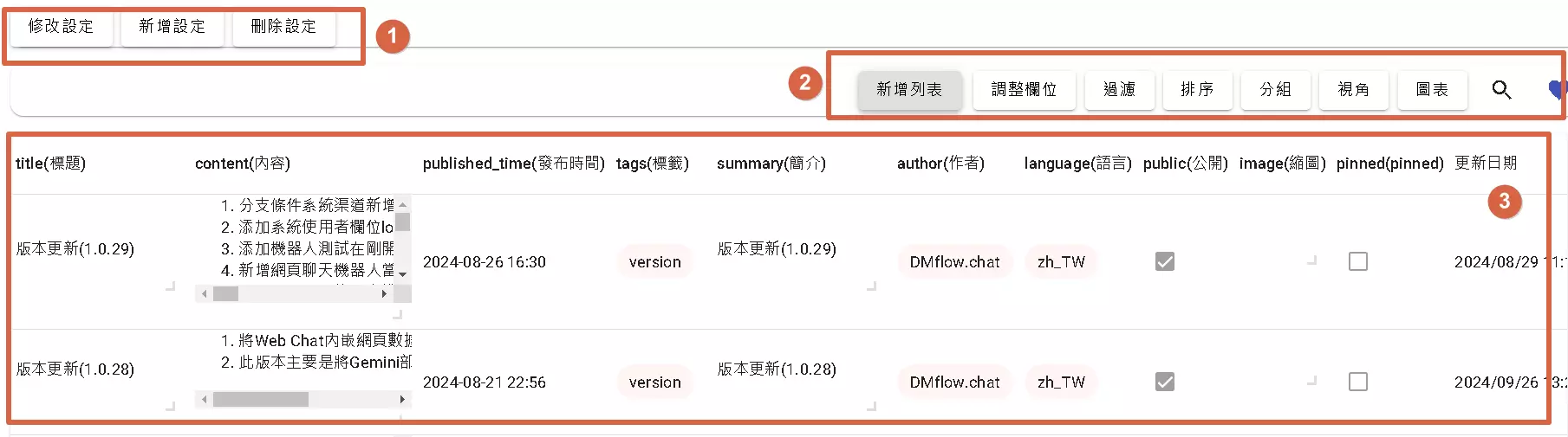
Here, you can:
- Manage All Settings: If you’re an admin, this is where you modify, add, or delete configurations.
- Customize Your View: Decide which fields to show and which to hide. Adjust it to your liking.
- See the Results: Based on your settings, this area displays the corresponding outcomes.
Alright, enough preamble. Let’s dive into the most crucial part: the “Settings”!
Start Setting Up Your First Form
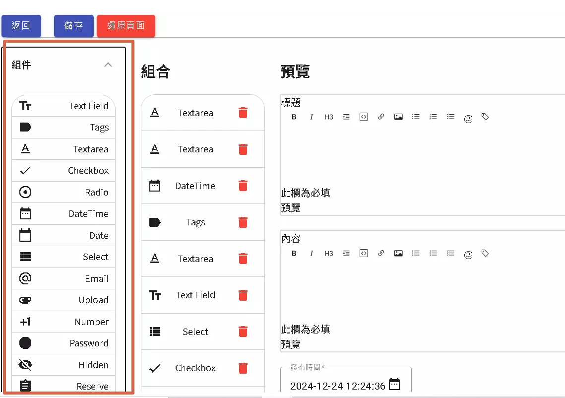
Imagine you’re playing with Lego. This settings interface is like your Lego workbench:
- Component Library (Left Side): This is filled with various “Lego bricks” – your form fields. Need a text box? Want a dropdown menu? Just drag it from here!
- Assembly Area (Middle): This is your “Lego model.” Place the components dragged from the left here, then configure their properties (like color, size, function – essentially, the field attributes).
- Preview Area (Right Side): Instantly see what your “Lego model” looks like as you build it. Change a setting, and the preview updates immediately!
Let’s check out the available components:
- Text Field (Single-line text input): Most common for short text like names or titles.
- Tags (Tag input): Perfect for categorizing content or adding keywords.
- Textarea (Multi-line text input): Choose this when you need longer input, like article content or detailed descriptions.
- Checkbox (Checkbox input): Allows multiple selections, like interests or agreeing to terms.
- Radio (Radio button input): Allows only one selection, such as gender or satisfaction ratings.
- DateTime (Date & Time picker): Use this for selecting a specific year, month, day, hour, and minute.
- Date (Date picker): For selecting only the date, like birthdays or event dates.
- Select (Dropdown menu): A common way to choose one or more options from a list.
- Email (Email input): Specifically for email addresses, includes format validation.
- Upload (File upload): Lets users upload images, documents, etc.
- Number (Number input): Restricts input to numbers only, like age or quantity.
- Password (Password input): For password entry, displays characters as stars or dots.
- Hidden (Hidden field): Need to record data without showing it to the user? Use this!
- Reserve (Reservation field): A handy tool for building online booking features.
How to use them? Super simple:
- Pick the component you want from the left.
- Click and hold, then drag it to the middle “Assembly Area.”
- Click the component you just added to configure its attributes (like naming it or setting a default value).
- Check the “Preview Area” on the right. Satisfied? Add the next component!
Next, let’s take a closer look at how each component can be configured.
1. What’s the Single-Line Text Field (Text Field) For?
This Text Field is basically a place for users to enter a single line of text. The settings might look like a lot, but don’t worry, let’s break them down:
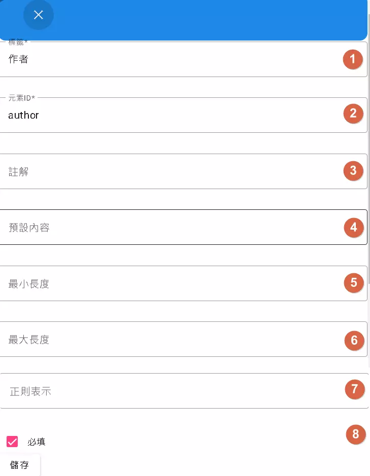
- Label: The prompt text next to the input box, telling the user what to enter. Like “Author” in the image, it clearly indicates the need for an author’s name. Without it, users might be confused.
- Element ID (Key): This is the unique “internal code name” for the system. It must be unique and cannot be repeated. The program uses this ID to retrieve the user’s input. In the image,
authoris its ID. Choosing a meaningful and memorable ID is crucial! - Placeholder: The gray hint text inside the input box that disappears when the user starts typing. Like “Please enter the author’s name,” it provides a helpful hint.
- Default Value: If you want the input box to have pre-filled text, enter it here. Users can use it directly or modify it.
- Minimum Length: Specifies the minimum number of characters the user must enter. No cutting corners allowed!
- Maximum Length: The maximum number of characters allowed. If exceeded, the extra characters might not be saved.
- Regular Expression: This is more advanced. It’s a “rule” used to validate the format of the input. For example, you can set rules to ensure the input matches a phone number format or an ID card format.
- Required: Check this box! This field becomes mandatory, and the form cannot be submitted without filling it. Don’t miss out on essential information! Want to make a field required? Check this box!
Understanding these settings allows you to make a simple text field smart and tailored to your needs!
2. Lots of Keywords? Use Tags (Tag Field)!
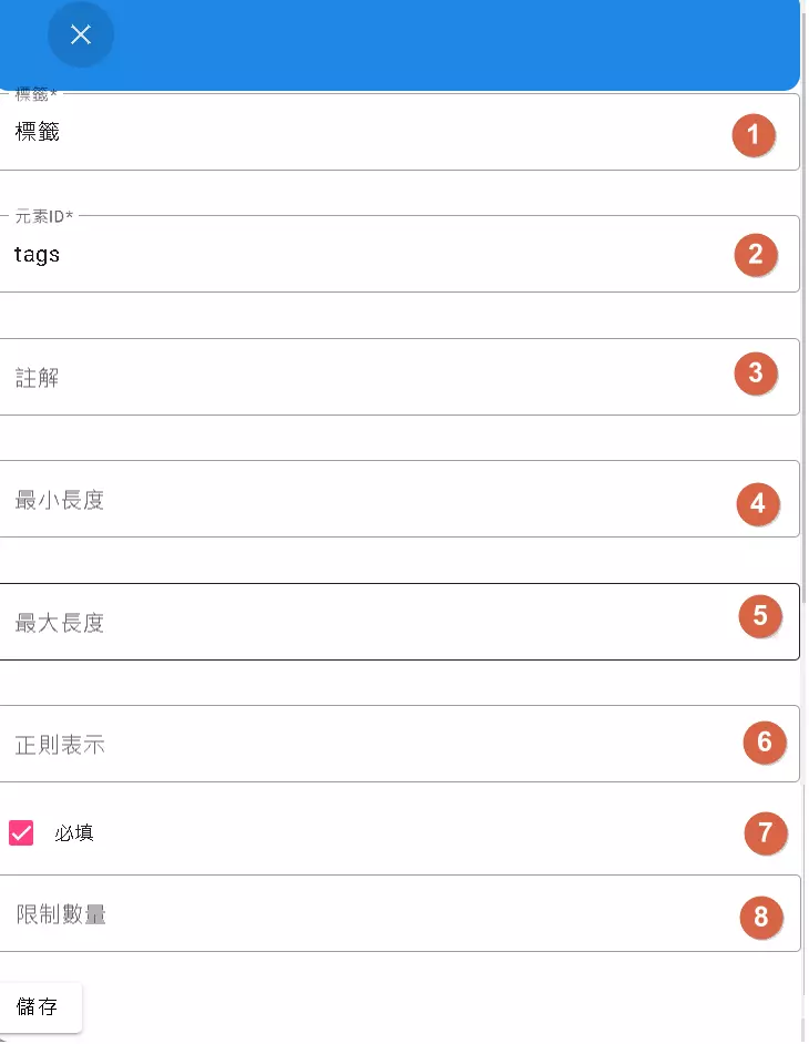
The Tags field is similar to Text Field, but it’s specifically designed for entering multiple keywords or tags. Think of the tags below a blog post or product categories – that’s the concept.
Let’s look at its settings:
- Label: Same as Text Field, tells the user this is for tags.
- Element ID (Key): The internal code name, must be unique. The example uses
tags. - Placeholder: Hint text inside the input, e.g., “Enter tags, separated by commas”.
- Minimum Length: Limits the minimum character count for a single tag.
- Maximum Length: Limits the maximum character count for a single tag.
- Regular Expression: You can also use rules to restrict the format of each tag.
- Required: If checked, the user must enter at least one tag to submit.
- Limit Quantity: Unique to the Tags field, this limits the maximum number of tags a user can add. Prevents tag overload!
How is it different from Text Field?
- Text Field usually holds a single value (one piece of text).
- Tags can hold multiple values (many tags), often separated by
|(or other delimiters). - Length and format validation in Tags apply to each individual tag, and there’s a quantity limit.
So, when you need users to input multiple categories or keywords, remember to use Tags!
3. Long Text? Leave it to Textarea (Multi-line Text Input)
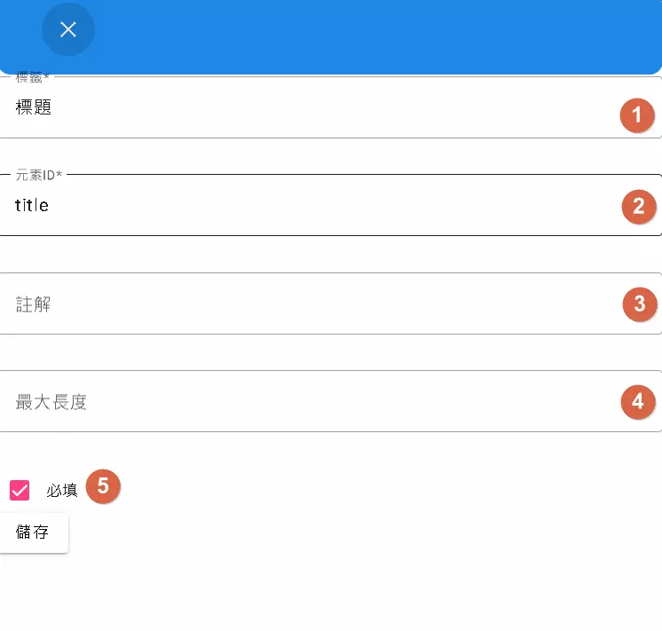
When a single-line Text Field isn’t enough, and you need to input several paragraphs – like article content, detailed descriptions, or user feedback – Textarea comes into play!
Its settings are relatively simpler:
- Label: Tells the user what this large box is for. The example shows “Title,” although titles are usually better suited for Text Fields, this is just an illustration.
- Element ID (Key): The internal code name,
titlein the example. - Placeholder: Hint text inside the input box.
- Maximum Length: Limits the total number of characters allowed. Note this: The image mentions a keyword limit of 255 characters, while Textarea can hold up to 16384 characters! If exceeded, the extra part will be cut off but still saved to the database.
- Required: Important long content shouldn’t be missed either.
So, what’s the difference between Text Field, Tags, and Textarea? Which one should I use?
- Text Field: Short, single-line text like names, titles.
- Tags: Multiple keywords or tags, separated by delimiters.
- Textarea: Long, multi-line text like articles, descriptions.
Key Reminder: Textarea input exceeding the maximum length will be automatically truncated. Remember to inform users about this limit!
4. Check it Off! The World of Checkbox
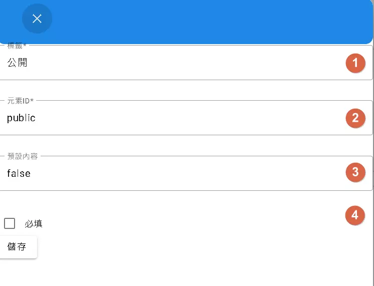
A Checkbox is that little square you can tick. It’s typically used for multiple-choice scenarios, like selecting interests, subscribing to newsletters, or agreeing to terms of service.
The settings are quite straightforward:
- Label: What does this checkbox represent? Write it here. The example is “Public,” indicating checking it makes something public.
- Element ID (Key): Internal code name,
publicin the example. - Default Value: Determines if the box is checked (
true) or unchecked (false) initially. The example isfalse, meaning it’s not public by default. - Required: This is a bit special. For a single Checkbox, setting it as required usually means it must be checked to submit (like agreeing to terms). For a group of Checkboxes, it might mean at least one must be selected. Honestly, though, single Checkboxes are rarely set as required.
Difference from other input fields:
Checkboxes primarily deal with Boolean (“yes/no”, “on/off”) choices, which is quite different from entering text or numbers. They can exist alone or grouped together for multiple selections.
Remember: A Checkbox’s value is essentially true (checked) or false (unchecked).
5. Only One Choice? Enter Radio (Radio Button)
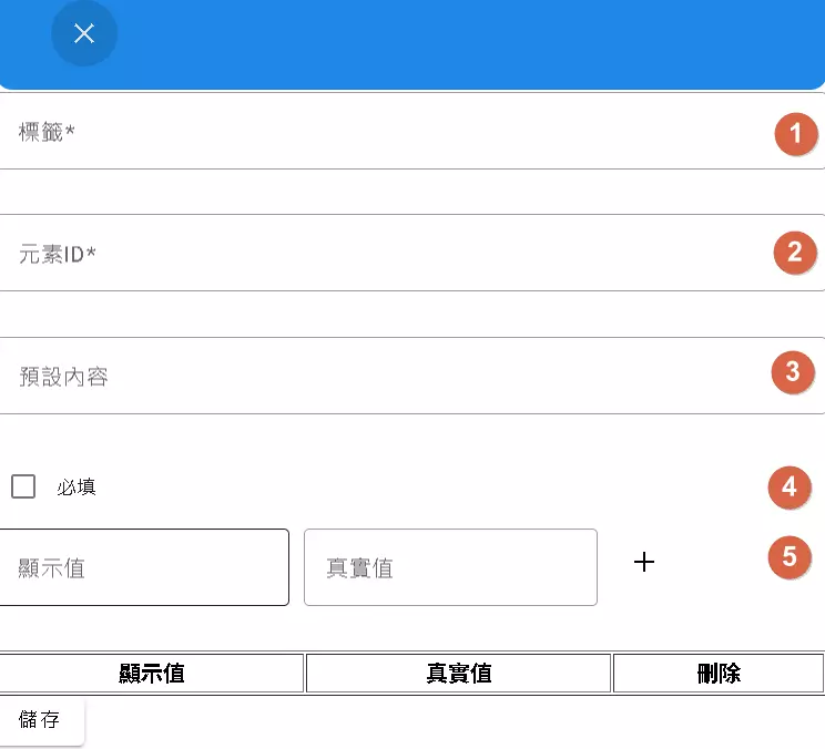
Unlike Checkboxes where you can check multiple options, Radio Buttons are a group of small circles where you can only select one. The classic example is choosing a gender!
Let’s look at the settings:
- Label: This usually refers to the meaning of the entire group of radio buttons, like “Gender.” The text next to each individual option is set in the “Multiple Group Value Selection” below.
- Element ID (Key): Important! The Key for all Radio Buttons within the same group must be identical. This tells the system they belong together, enabling the mutual exclusivity (“select A deselects B”) effect. For example, set the Key for the gender group to
gender. - Default Value: Sets which option is selected by default initially. You need to enter the option’s actual Value, not its displayed text!
- Required: If checked, the user must select one option from this group to submit.
- Multiple Group Value Selection: This is the core area for setting up radio button options!
- Label (Display Value): The option text users see on the screen, e.g., “Male,” “Female,” “Other.”
- Value (Actual Value): The value stored internally by the program, usually English or numbers, e.g.,
male,female,other. This makes data processing easier later. - Click “+” to add options, “Delete” to remove them.
The biggest difference from Checkbox:
- Checkbox: Can select multiple; options are independent.
- Radio Button: Can select only one; options are mutually exclusive.
Key Points: Remember to use the same Key for a group of Radio Buttons, and distinguish between the “Label (Display Value)” and the “Value (Actual Value)”!
6. Need Date and Time? DateTime Handles It!
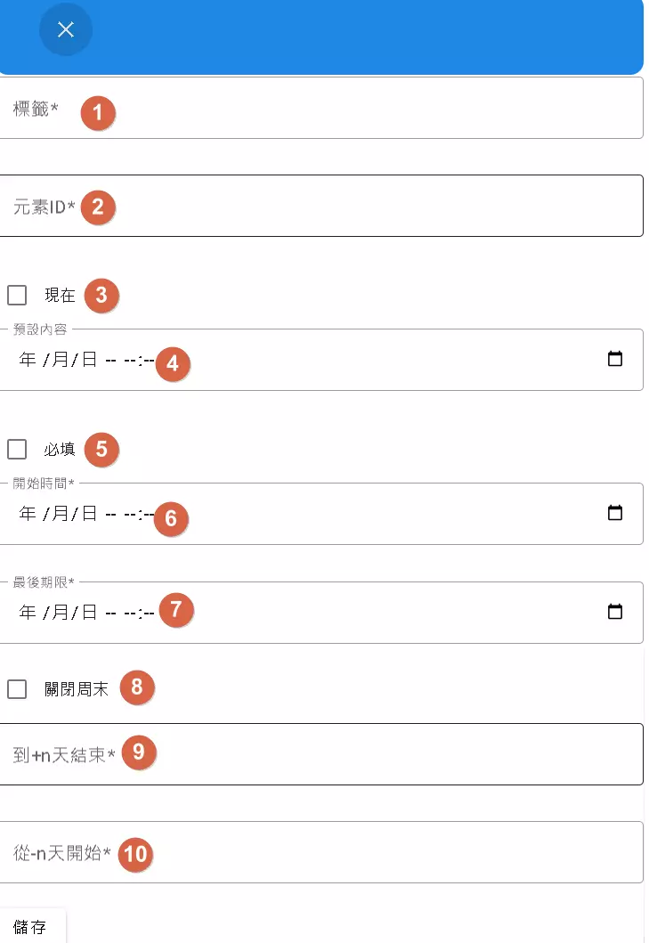
When you need users to select a precise “Year/Month/Day Hour:Minute,” the DateTime picker is the tool! Think booking meetings, setting event times, etc.
It has quite a few useful settings:
- Label: Explains what this date and time is for, e.g., “Meeting Start Time.”
- Element ID (Key): Internal code name, e.g.,
meeting_start_time. - Default to Current Time: Check this, and the field will automatically populate with the current date and time. Note: Checking this will hide the “Default Value” field!
- Default Value: If you don’t want the current time, you can manually set a default date and time here, format like “2024/12/25 - 10:00”.
- Required: Must the user select a time? Check it!
- Must be after Start Time: Typically used for setting an “End Time” to ensure it’s not earlier than the start time.
- Must be before End Time: Typically used for setting a “Start Time” to ensure it’s not later than the end time.
- Disable Weekends: Don’t want users selecting Saturday or Sunday? Check this! Good for workday bookings.
- End in +n Days: Restricts selection to dates within the next “n” days starting from today. E.g., entering 7 allows selection within the next week.
- Start in -n Days: Restricts selection to dates from “n” days ago onwards (relative to today). E.g., entering 7 allows selection from 7 days ago up to the future (inclusive of today). Effectively, it means selection starts from today if n=7 implies past 7 days are disabled. Correction/Clarification: Usually means you can only select dates starting from
today - n daysonwards. Let’s assume the original meaning: limits selection starting fromtoday - n days. E.g., 7 means the earliest selectable date is 7 days ago. Re-evaluating the Chinese從 -n 天開始: This usually means selection is allowed *starting from n days ago. A value of 7 means you can pick today, yesterday… up to 7 days ago, and future dates.* Let’s refine: Start in -n Days: Allows selection starting from n days before today. E.g., 7 means the selectable range starts 7 days ago and goes into the future.
Key Point: Time logic is important! The “Start/End Time” and “+n/-n days” options need to be configured correctly to prevent users from selecting invalid times. Also, “Default Value” and “Default to Current Time” are mutually exclusive.
7. Just Need the Date? Use Date (Date Picker)
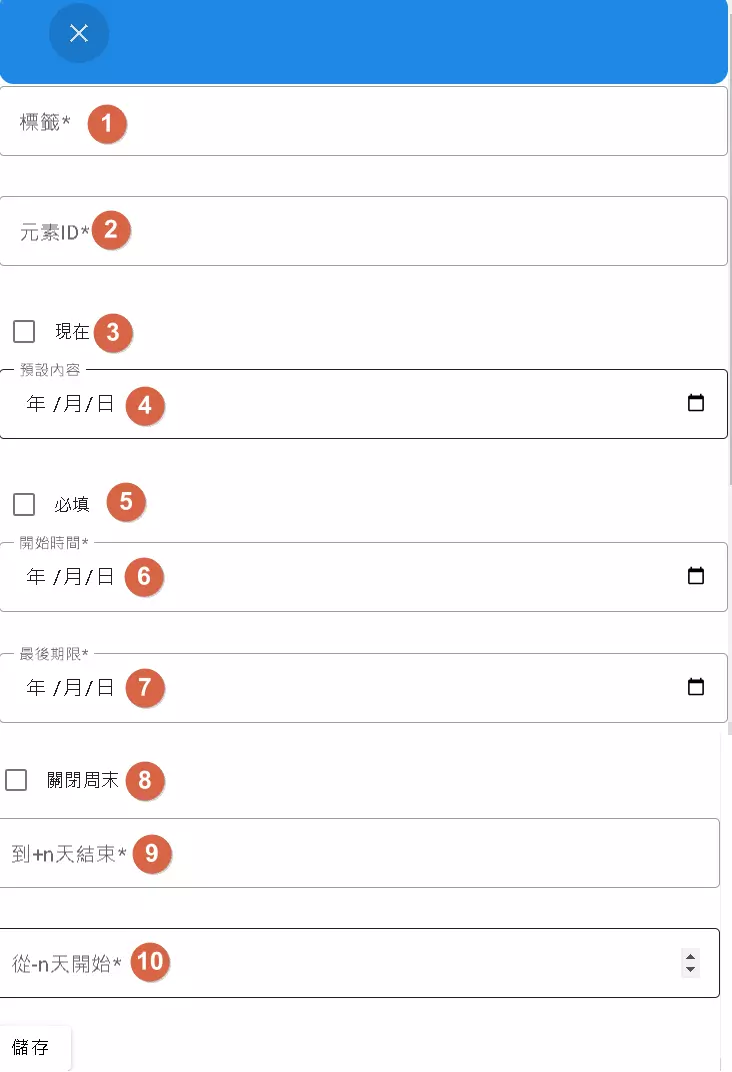
If you only need users to select the “Year/Month/Day” without the time, the Date picker is sufficient and simpler! Perfect for birthdays, anniversaries, etc.
Its settings are almost identical to DateTime, just without the time part:
- Label: Explain the purpose, e.g., “Date of Birth.”
- Element ID (Key): Internal code name, e.g.,
birthday. - Default to Current Date: Check to default to today’s date. Again, this hides “Default Value.”
- Default Value: Manually set a default date, format like “2024/12/25”.
- Required: Must the user select a date?
- Must be after Start Date: Here, “Start Time” actually means “Start Date.”
- Must be before End Date: Here, “End Time” actually means “End Date.”
- Disable Weekends: Cannot select Saturday/Sunday.
- End in +n Days: Can only select within the next n days.
- Start in -n Days: Can only select starting from n days ago onwards.
Difference from DateTime: Just lacks the time selection feature! All other logic is the same.
So, based on your needs, if time selection isn’t required, use Date for a cleaner interface.
8. Too Many Options? Use Select (Dropdown Menu)!
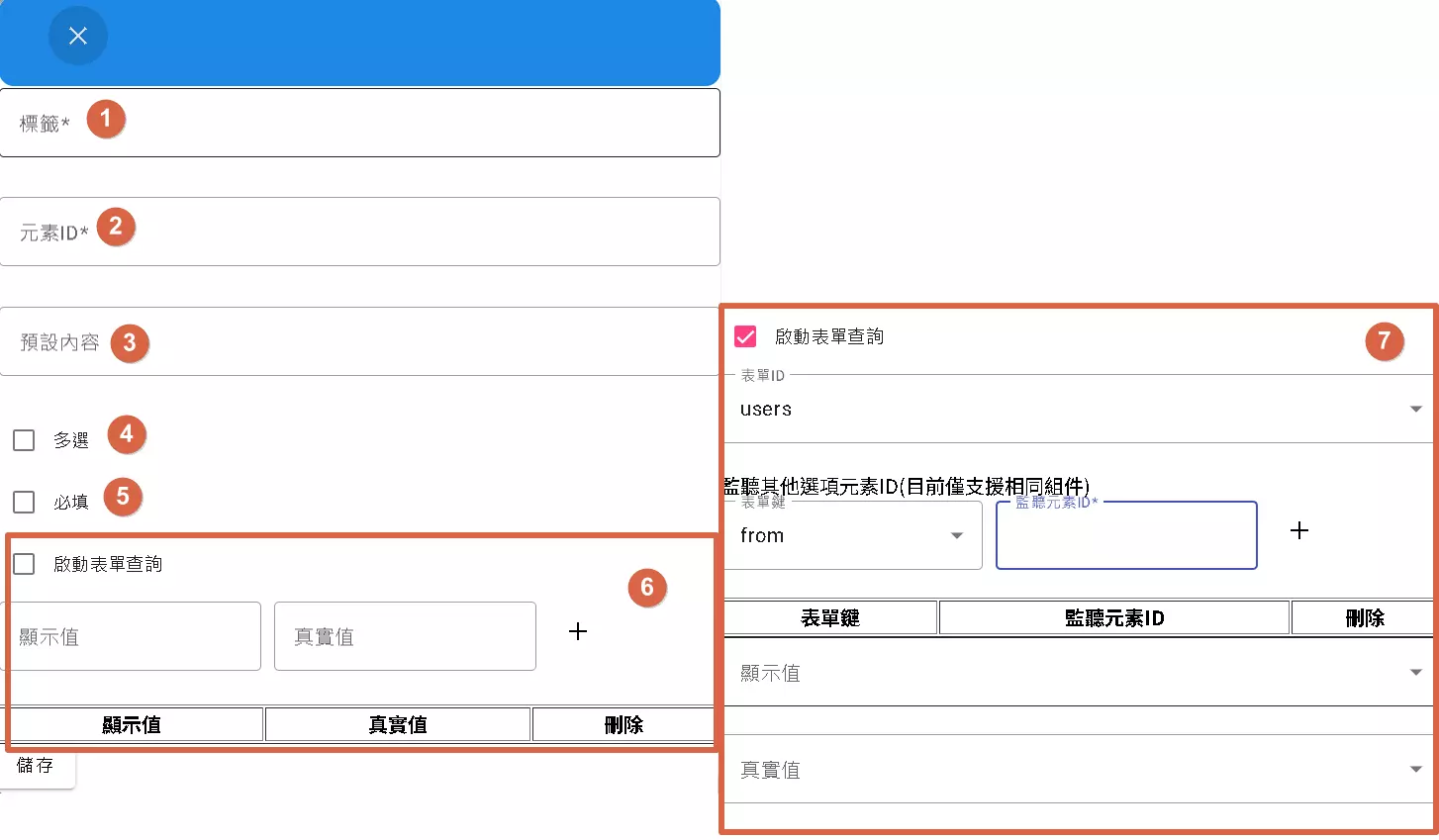
Everyone’s familiar with the Select dropdown menu – click it, and a list of options appears. It has two main configuration methods:
Basic Settings:
- Label: Explain what this menu is for, e.g., “Select Department.”
- Element ID (Key): Internal code name, e.g.,
department. - Default Value: Set the default selected option(s) using the option’s Value.
- Multiple Select: Check this to allow selecting multiple options (using Ctrl or Shift). Unchecked means single selection only.
- Required: Must the user select one (or more, if multiple select is enabled)?
Option Source Settings (Choose one):
- Manual Input: (Marked as 6 in the image)
- Use this if you have a small, fixed list of options.
- Similar to Radio Buttons, you need to set the Label (display text) and Value (internal value) for each option.
- Click “+” to add options.
- Form Query: (Marked as 7 in the image, check “Enable Form Query”)
- This is cooler! Use this if your options are dynamic or come from another form’s data.
- Form ID: Select the form you want to pull data from.
- Listen Element ID: Choose a “trigger” field. When the value of that field changes, the options here will automatically re-fetch and update! However, it seems currently it can only listen to components of the same type.
- Form Key: Specify which field from the source form should be used as the option’s Value.
- Display Value: Specify which field from the source form should be used as the option’s Label.
- This method is especially suitable for options that change frequently or when there are many options.
Important Reminders:
- When using “Form Query,” the number of fetched options might be limited, and they are dynamic.
- “Listen Element ID” can create neat cascading effects! E.g., select a state, and the city options update automatically.
- Always distinguish between “Display Value (Label)” and “Actual Value (Value)”.
9. email, number, password: Text Field Transformers
These three: email, number, and password, can essentially be seen as “specialized versions” of the Text Field. They all have the basic settings like Label, Key, Default Value, and Required.
Their specialties lie in:
- email:
- Specifically for entering email addresses.
- Usually includes built-in basic format validation (checks for
@, domain format, etc.) for initial filtering.
- number:
- Restricts input to numbers only.
- May have additional settings like maximum/minimum values, allowing decimals, etc.
- password:
- Displays input as stars
*or dots•for privacy. - Crucially Important: Passwords must never be stored in plain text in the database! They must be processed using “Hashing”.
- Displays input as stars
About Password Security (Pay Attention!):
- Hashing: A one-way encryption method that turns your password into a seemingly random string of characters (a hash). Even if the database is compromised, attackers can almost never reverse the hash to get your original password.
- BCrypt: We use BCrypt, a widely recognized secure hashing algorithm.
- How to Use:
- Storing Encrypted: Use the trigger parameter
{{Utils.passwdEncode(node.start.password)}}. Here,node.start.passwordrefers to the user-entered password variable. This syntax encrypts it using BCrypt before saving. - Verifying Login: Use the function
Utils.passwdVerify(node.start.password). This takes the password entered during login, hashes it the same way, and compares it to the hash stored in the database. If the two hashes match, the password is correct. Note: You compare the hashes, not the original passwords!
- Storing Encrypted: Use the trigger parameter
In short: email and number add format validation, while password adds display masking and mandatory secure encryption handling. Later sections will cover password handling in more detail – make sure to read them!
10. Let Users Upload Files? Use File Upload!
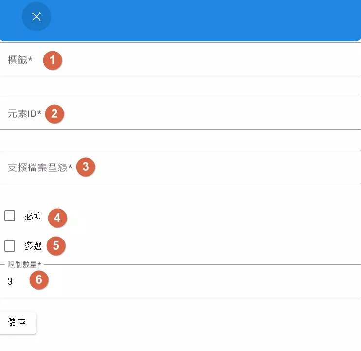
Need users to upload images, documents, or resumes? Then you need the File Upload component!
Let’s see how to set it up:
- Label: Explain what kind of file to upload, e.g., “Upload Profile Picture.”
- Element ID (Key): Internal code name, e.g.,
profile_picture. - Supported File Types: Very important! Determines which file types users are allowed to upload. You can specify using MIME types (like
image/*for all images) or file extensions (like.pdf,.docx). Separate multiple types with commas. This prevents users from uploading random files. - Required: Is file upload mandatory?
- Multiple Select: Check to allow users to select and upload multiple files at once.
- File Limit: If multiple selection is allowed, you can limit the maximum number of files here.
However! There are some “very important” limitations to note:
- Size Limit: Currently, the maximum size for a single file is 5MB.
- Functionality Limit: Only forms configured here in the “Dashboard” can actually use the file upload feature.
- Will Be Skipped: If you trigger the form via a chatbot or a shared link, even if you’ve set up a file upload field, this feature will be skipped and won’t appear!
So, if you need users to upload files within a chatbot conversation, you might need to consider alternative methods.
11. Hiding Data in Plain Sight? The Use of Hidden Fields
Sometimes, we need to record information without letting the user see or modify it. That’s where the Hidden field comes in handy. It’s invisible on the screen, but its data is still submitted with the form. Note: This feature primarily works in forms within the Dashboard; it might not function correctly in chatbots.
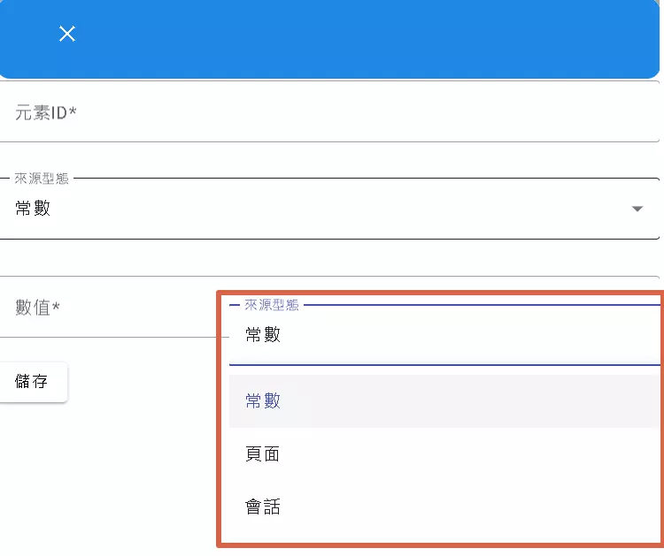
The key setting is the “Source Type”:
- Element ID (Key): Must be set; this is the internal code name.
- Source Type: Determines where the hidden field’s value comes from.
- Constant: The value is fixed. Whatever you enter during setup is what it will always be. Suitable for version numbers, fixed tags, etc.
- Value: Enter the desired fixed value here.
- Page: The value comes from parameters in the URL the user clicked. For example, if the link is
product_id=123, you can set a Hidden field to capture the value ofproduct_id(which is 123).- Value: Enter the URL parameter name you want to capture (e.g.,
product_id).
- Value: Enter the URL parameter name you want to capture (e.g.,
- Session: The value comes from the currently logged-in user’s information.
- Value: Often
userId, used to silently record which user submitted the form.
- Value: Often
- Constant: The value is fixed. Whatever you enter during setup is what it will always be. Suitable for version numbers, fixed tags, etc.
Simply put: Hidden fields are a great way to secretly include extra information in the background. Whether you need to include a fixed value, a parameter from the URL, or the current user’s ID, you can configure it using the “Source Type.”
12. Want a Booking Feature? Try reserve!
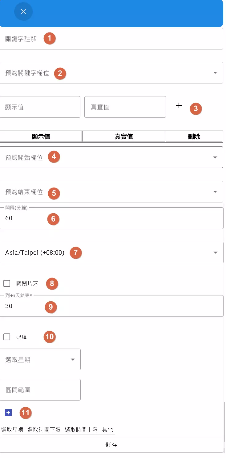
DMflow also includes a built-in Reserve component, allowing you to quickly create a basic reservation system.
The settings are a bit numerous, let’s break them down:
- Keyword Placeholder: Reservations usually need a “target,” like a meeting room or service. This placeholder hints to the user what keyword to enter.
- Keyword Field: The internal Key to store the keyword entered or selected by the user.
- Keyword Select Options (Label & Value): If your reservable items are fixed options (e.g., only three meeting rooms), you can set them up here for users to select, including both “Display Value (Label)” and “Actual Value (Value)”. Leave blank if you want users to input freely.
- Reservation Start Field: The internal Key to store the reservation start time.
- Reservation End Field: The internal Key to store the reservation end time.
- Interval: Sets the duration of each reservation slot (in minutes). E.g., 60 means one-hour slots. Note: Setting break times within intervals is currently not supported. If you need a 1-hour booking with a 15-minute break, you’d have to set the interval to 75 minutes.
- Time Zone: Sets the time zone used for reservations. The system automatically converts based on the user’s browser time zone, which is convenient!
- Disable Weekends: Don’t want weekend bookings? Check it.
- Maximum Reservation Days: Limits how many days into the future users can book.
- Required: Is completing the reservation information mandatory?
- Select Weekdays and Open Hours: Allows detailed configuration of which days of the week are open for booking and the open hours for each day.
But! The Reserve feature also has some “buts”:
- No Automatic Reminders: The system itself doesn’t automatically remind clients about upcoming reservations. You need to set up triggers and schedulers yourself to fetch data and send reminders.
- No Built-in Integration: Want to sync bookings with external tools like Google Calendar? You need to set up a trigger yourself to call the external API upon successful reservation.
- Disabling Same-Day Bookings: Want to prevent users from booking for “today”? You might need to manually add a dummy booking for today in the data to block slots or use a background process to check and handle it.
- Basic Functionality: If you need more complex, professional booking features (like multi-person bookings, resource management, payment integration), DMflow’s Reserve might not suffice. Consider using a link from a professional booking service (like Calendly) within your bot.
In summary, Reserve provides a basic booking framework, but many advanced features or automation processes require manual implementation!
13. paragraph: More Than Just Text
The Paragraph component seems simple – just display a block of text. But it has a special purpose:
- In a chatbot, the content of a Paragraph becomes the bot’s spoken message!
So, you can use Paragraph to define the bot’s opening lines, explanatory text, or any content you want the bot to “say.”
14. button: Triggering the Next Step
A Button is an interactive element that users click to trigger an action.
You can set:
- Button Text: Clearly tell the user what clicking does, e.g., “Submit,” “Next,” “Learn More.”
- Trigger ID: This is key! Each button must be linked to a “Trigger.” The Trigger defines what should happen when the button is clicked. For example, the Trigger ID might be
submit_application_form, and the settings within that trigger would execute the action of “submitting the application form.”
Simply put, the button is responsible for “being clicked,” and “what happens after clicking” is determined by the “Trigger” it’s linked to.
Wow! We’ve gone through all the basic form components. Feeling like DMflow’s form capabilities are quite powerful? Hold on, there are even more advanced tricks!
Fine-Tuning Your Fields: The Field Adjustment Feature
After designing the basic structure of your form, sometimes you need to make minor adjustments. This is where the “Field Adjustment” feature comes in.
Here are several useful adjustment options:
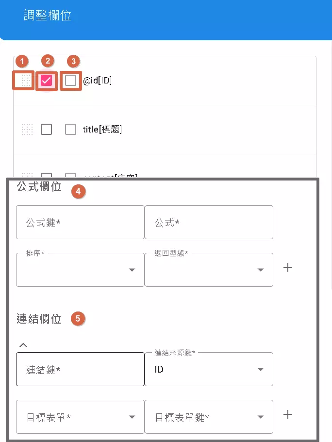
- Drag to Adjust Display Order: (Marked as 1)
- Field order doesn’t feel right? Just drag and drop them to change their sequence on the form!
- Hide This Field: (Marked as 2)
- Similar to the Hidden component, but this applies to existing fields. Checking this prevents the field from being displayed to the user on the front end. Good for hiding fields needed only internally.
- Field is File (Only for Keywords): (Marked as 3)
- A special function that can turn a “keyword” field into a “file upload” field. But only applicable to keyword fields.
- Formula Field: (Marked as 4)
- Want to perform calculations within the form? Use this! You can automatically calculate the value of this field based on the values of other fields using a formula.
- Formula Key: The internal code name for this formula.
- Formula: The actual calculation formula, written using specific syntax.
- Order: If you have multiple formulas, this determines their calculation sequence.
- Return Type: Is the calculated result a number, text, or another type?
- Want to know how to write formulas? Refer to DMflow’s official documentation for more details.
- Link Field: (Marked as 5)
- Can you link data from different forms? Yes! This powerful feature lets you associate a field in the current form with a field in another form.
- Link Source Key: Which field in your current form is the starting point for the link?
- Link Key: Which field in the target form does this source key correspond to?
- Target Form: Which form do you want to link to?
- Target Form Key: Which field in the target form is being linked to?
- Example: You have a “Product List” form (with Product ID, Product Name) and an “Orders” form (with Order ID, Product ID). You can link the “Product ID” in the “Orders” form to the “Product ID” in the “Product List” form. This might allow you to automatically display the product name when viewing an order!
With these adjustment features, your forms can become smarter and better aligned with your business logic!
Phew! That was a comprehensive introduction to the DMflow form system’s features, from basic component settings to advanced field adjustments. Hopefully, this guide helps you better understand how to leverage DMflow to build the forms you need.
Stay tuned for the next article, which will delve deeper into triggers, flow control, and more!

